
Thursday, December 12, 2013
My inspiration for candids
Friday, November 8, 2013
Warm's Eye 4

Warms Eye 2 and 3


Warm's Eye 1

Bird's Eye 3

Bird's Eye 2

Bird's Eye 1

Monday, October 21, 2013
Edward Steichen
Edward is best known for being the first American modern fashion photographer, which is a pretty big deal. Steichen was also a painter. He also won an academy award for best documentary and worked for advertisement agencies. Edward was the director of department of photography after WW11 at the New York museum of modern art. The picture of the woman in the chair is really good. I love your face impression and she just looks like drugged out and exhaustive, not posing. The second picture of the woman with the long dress is really cool too. I don't really like the dress but the photo is really cool.


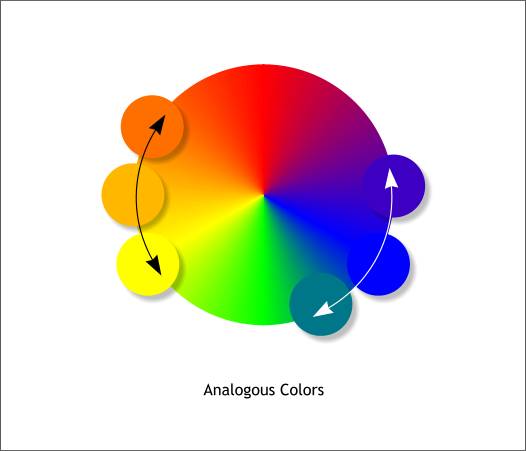
Pre assignment for Analogous
Analogous colors are the colors adjacent to each other on the color wheel, so it's the opposite of complementary colors.


Friday, October 18, 2013
Gertrude Kasebier
Gertrude was an influential photographer of the early 20th century. She was most known for her paternity photos and her Native American photos. She also stood for photography as a real profession.

I like this photo because of the back round. Like the whole image with the mother holding the child is a really powerful image and when you put it in a barn type thing, it really makes it strong. Also, the while dress in the barn is a really cool contrast.
The photo of the indian is like one of the only indian photos I found from her that I liked because all the others were just really original and I think this one is different. The circle around the eye business is really cool and something I haven't seen before that I remember. Also, is this a guy or a girl? I kind of like that I don't like that. The clothes on this person is also really cool. The jewelry on the neck and the head wear are great together.
 The last photo of the woman reading the book is also really cool. She gives a really strong feeling. I feel like she's saying, yeah you pissed me off and I'm pregnant so go away and let me read in peace because I don't like you anymore.

I like this photo because of the back round. Like the whole image with the mother holding the child is a really powerful image and when you put it in a barn type thing, it really makes it strong. Also, the while dress in the barn is a really cool contrast.
The photo of the indian is like one of the only indian photos I found from her that I liked because all the others were just really original and I think this one is different. The circle around the eye business is really cool and something I haven't seen before that I remember. Also, is this a guy or a girl? I kind of like that I don't like that. The clothes on this person is also really cool. The jewelry on the neck and the head wear are great together.
Thursday, October 17, 2013
Mums and Peppers

Salem
Color

Wednesday, October 9, 2013
Edward Curtis
Edward Curtis is best known for photographing American West and Native American people.
This first photo is very stereotypical, which caught my eye. It is very pretty though, i feel like it would be a painting because finding an image like this must be so beautiful. I wonder if he had the indian bring the horse there and posed them like this. If not, he is crazy lucky to catch this. The second photo with the men on the boat is really nice. It's got that killer diagonal like that photographer strives for, as do our minds. Hes his the three like rule with the back tip of the boat, great straight line of the water also. Photo is just amazing. The boats packed, but the simple back round is balanced. The third photo with the horseback riders riding away was also an eye catcher. The things draping over their head create an amazing match of the shapes of the mountains behind them.


This first photo is very stereotypical, which caught my eye. It is very pretty though, i feel like it would be a painting because finding an image like this must be so beautiful. I wonder if he had the indian bring the horse there and posed them like this. If not, he is crazy lucky to catch this. The second photo with the men on the boat is really nice. It's got that killer diagonal like that photographer strives for, as do our minds. Hes his the three like rule with the back tip of the boat, great straight line of the water also. Photo is just amazing. The boats packed, but the simple back round is balanced. The third photo with the horseback riders riding away was also an eye catcher. The things draping over their head create an amazing match of the shapes of the mountains behind them.

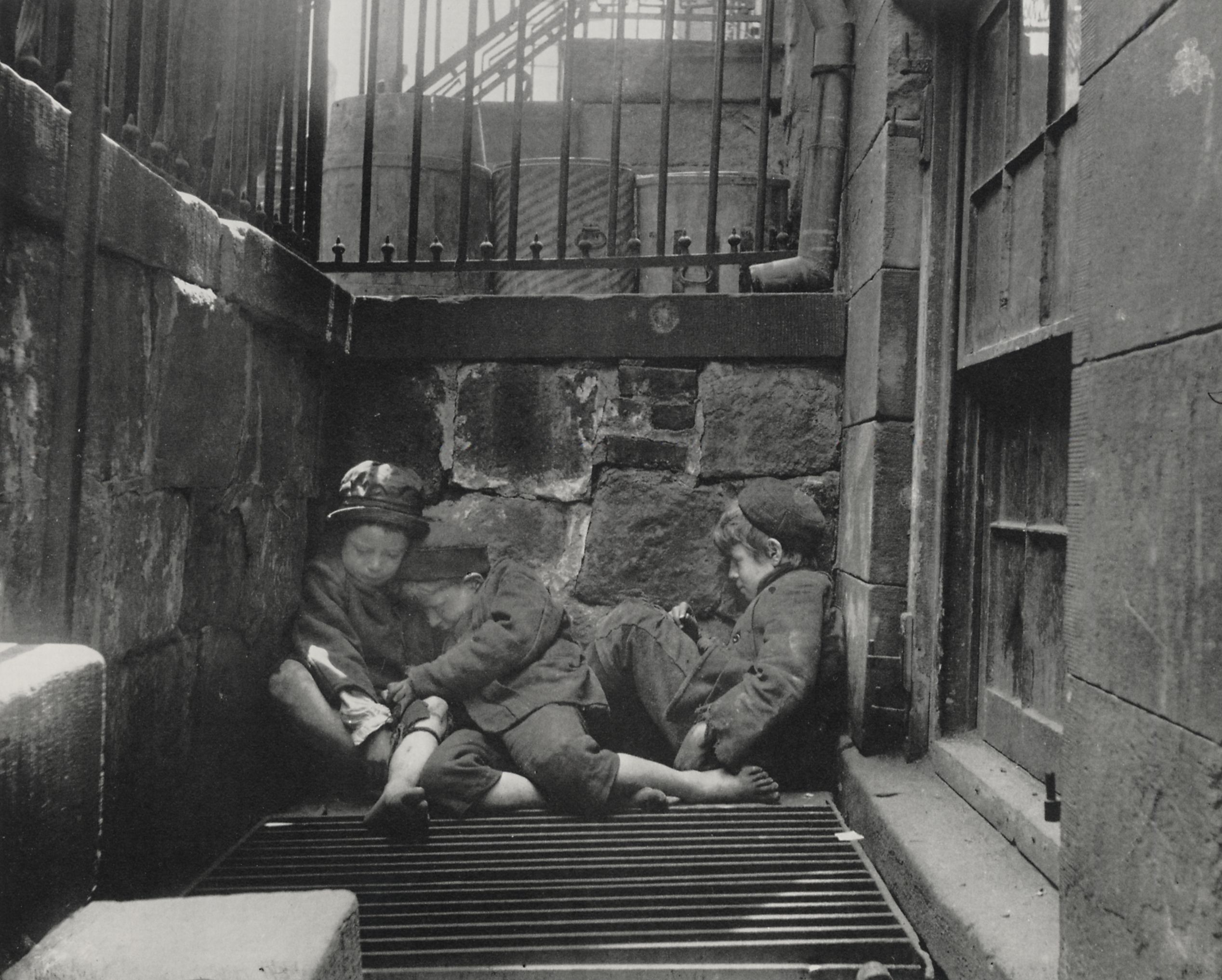
Jacob Riis
Jacob Riis was best known for his work with poverty. After experiencing it himself, he took casual photos and wrote about it. He is well known for his casual photos and his flash photography. After living the life of a poor New Yorker, Riis became a police reporter writing about the poor conditions and the hardship that the poor people of New York had to face.


This is what is meant by casual photography. No posing, no makeup or hair crew, just casual. Riis used photos like these to help the poor make people understand their hardships that they go through every day. This boy is young, and seeing this photo people will pity him, and hopefully help.
The second photo is much like the first but caught me in a different way. When young boys are piled up together trying to sleep in a corner of a stone wall, you think they're cold. You think that all they have is each other, and that could be exactly what Riis wanted to officials to see in this image.
The third image is a different point of view for poverty. Other than the boys only having each other, this image shows how many people are in need. There's obviously an abundance of people living on this floor of this warehouse, and they all need help. Riis was probably trying to show that there is too many.
Monday, October 7, 2013
Eadweard Muybridge
Eadweard had a very unique life. He started out photographing motion pictures in England. Although he loved to take motion pictured he became famous for his landscaping pictures of California. Muybridge was also was hired to photograph by the U.S. Army Modac War. And then he killed a Major for having an affair with his wife. It was deemed a justified murder and he went on to teach his photography skills.
 This image explains why his landscape photography made him so famous. When I went on vacation and toured waterfalls I thought it was so hard to take a photo that brings the beauty to justice, but he did it! The Trees are so beautiful and thin and the waterfall is falling to straight and there's no awkward angles occurring which is something I struggle with, but yeah I love this photo.
The second photo below is also breath taking. The big rocks in the back round manage to favor the trees below it. Sometimes images like these can go wrong I think because there is just so much to look at and when you are in person and there'
s a lot to look at its amazing but in a photo it can be busy.
And this computer hates me so this format is awkward but the images of the two women in an example of his motion picture, honestly I don't really like any of them I found because they are just really ordinary, but not a lot of people do things like this so he can have credit for that! Like most other people, I think that his landscape work is what makes him amazing.
Friday, October 4, 2013

Julia Margaret Cameron
Julia received her first camera in 1863. It was a gift from a daughter in law and she immediately loved it. Julia started very amateur and had no intention on doing commercial photography. She had friends and family that were writers and scientist and she captured images for them. Also, she moved on to take pictures of people. But the people that modeled for her were called her victims because of how unprofessional she was and how messy and unorganized she kept anything. Julia wasn't recognized universally. But people began to give her credit for her stubbornness and that she wasn't giving up. By 1875 Julia had over 800 images in many extraordinary exhibits.
 I like this image because the boy looks very natural just sitting there. I'm not really sure what he is wearing but it's working for him. You can also tell in his face that he's not that comfortable at all.
The image below with the man is cool because his face impression is really disturbed. Also I like it because of the lighting.
I like the image with the woman a lot more. She doesn't look like she is modeling and the feelings that her face shows seem very sincere and real to me.

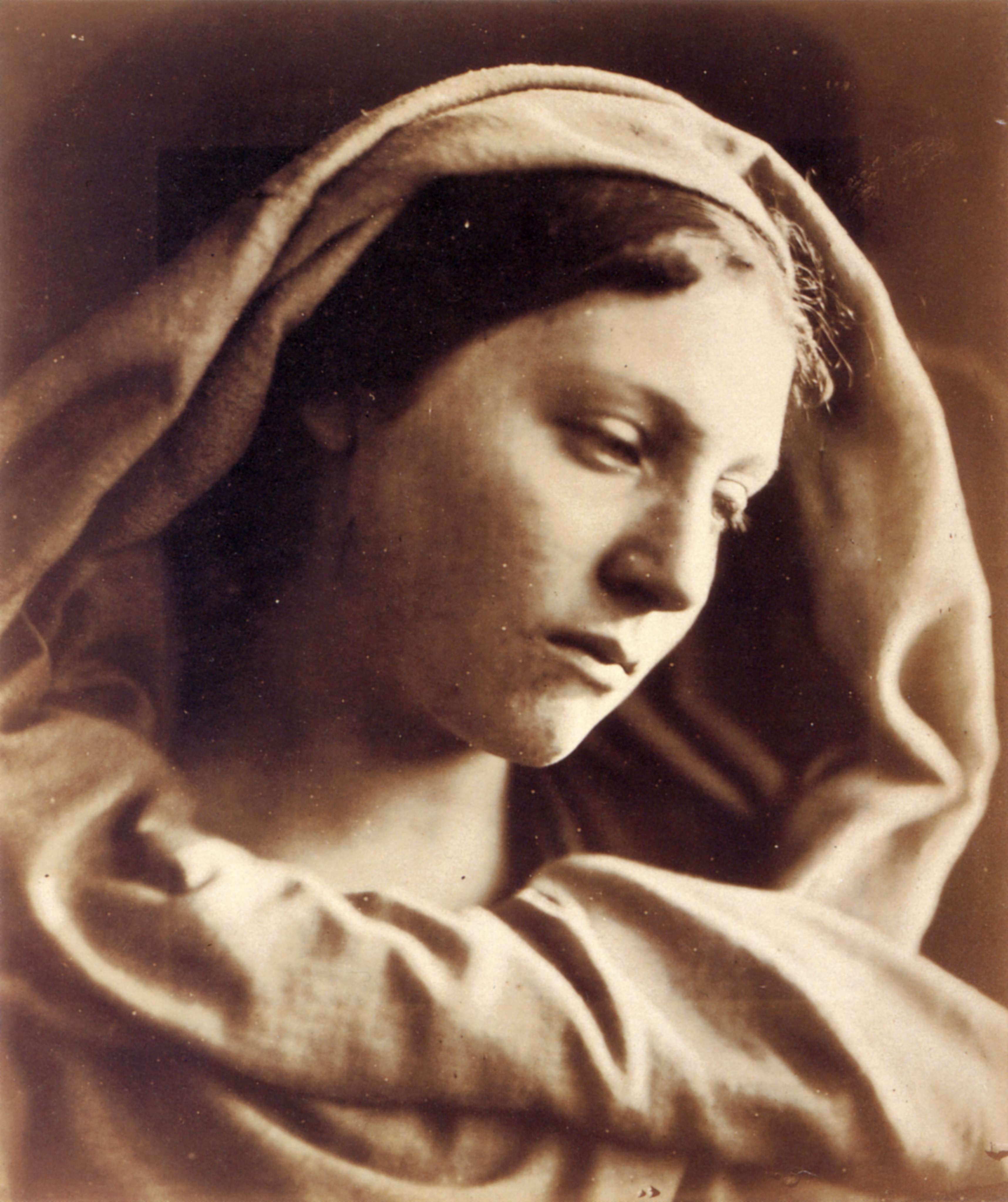
The image below with the man is cool because his face impression is really disturbed. Also I like it because of the lighting.
I like the image with the woman a lot more. She doesn't look like she is modeling and the feelings that her face shows seem very sincere and real to me.
Thursday, October 3, 2013
Henri Cartier-Bresson
Henri was a french photojournalist. He wasn't only a photographer was a writer, a film maker, and a painter. He only got into photo when he was painting. It seems to me that he liked taking pictures of people the most.

I like this one a lot because the roads are very ordinary, the boys are very ordinary, but they are being silly and it's cute. Usually people like to take pictures of kids hugging or being lovey dovey or something but he really captured what its all about to be a youngin i think.
I like this photo because it baffles me. The lady looks sick or pissed off or something. Her body language and her face are very unhappy. She's in a room with chairs so shes probably waiting for something and shes not very patient.

 I like this one because its really different. Its wierd how she is coming out of the door
I like this one a lot because the roads are very ordinary, the boys are very ordinary, but they are being silly and it's cute. Usually people like to take pictures of kids hugging or being lovey dovey or something but he really captured what its all about to be a youngin i think.
I like this photo because it baffles me. The lady looks sick or pissed off or something. Her body language and her face are very unhappy. She's in a room with chairs so shes probably waiting for something and shes not very patient.
Ansel Adams
Ansel Adams
Ansel Adams was born in San Francisco, California on February, 20, 1902. Ansel was born into a rich family that was created by her grandfather, a wealthy timber baron. Her father was Charles Hitchhock Adams, who was a successful business man and a husband to Olive Bray. In 1907 though, nothing was left after a horrible earthquake that ruined the family fortune. During that earthquake, Adams broke his nose and it gave him his infamous look.
http://www.biography.com/imported/images/Biography/Images/Profiles/A/Ansel-Easton-Adams-9175697-2-402.jpg


I really love this image because it is so screwed up. I love how the tree is all going the wrong way and the rocks are all flat like the tree is taking over.
 I like this photo because there is almost a contrast between the different kinds of leaves. You don't really see the ever green pine needles with a regular leaf from a different tree falling together. Many artist have taken a picture with a group of one kind of leaf but this artist is combining the different kinds to make something unique and it totally worked for him.
I like this photo because there is almost a contrast between the different kinds of leaves. You don't really see the ever green pine needles with a regular leaf from a different tree falling together. Many artist have taken a picture with a group of one kind of leaf but this artist is combining the different kinds to make something unique and it totally worked for him. Artists that use color contrast
Cee Neuner is an artist that likes to do contrast in color.
Here are some of her images:
I really like this first one, like crazy like. I think the reason why I like it so much is because the white mug matches the white plate, the muffins in the basket matches the muffin creating contrast on the plate, JUST SO MUCH CONTRAST!

 I really like this image because its so real and simple but the contrast is beautiful
Here are some of her images:
I really like this first one, like crazy like. I think the reason why I like it so much is because the white mug matches the white plate, the muffins in the basket matches the muffin creating contrast on the plate, JUST SO MUCH CONTRAST!
Preassignment Assignment
I just got an assignment and we have to do complement. I think im going to just go out to a garden center first and looks for contrasts that stick out to me, and if that doesnt work then im just gonna drive around
Heres my assignment:
Your next assignment is to capture images that have the greatest color contrast and as a result are brighter and more visually charged. To do this you will look for situations where complementary colors exist. Something red, like a fire hydrant, in a green field will make the red stand out by contrast to the green. This will be challenging, like a scavenger hunt... but once you get started you might find that you will see complementary colors everywhere. If you cannot find 10 images you can create them -- yellow flowers with one purple flower... red roses with green leaves... a child's red fire truck on a green blanket. Study the color wheel below, make notes of the opposites and happy hunting. (Orange leaves against a blue sky?)
What are complementary colors?


http://www.digital-photo-secrets.com/tip/1128/make-your-photos-more-colorful-with-complimentary-colors/ary colors.
Heres my assignment:
Your next assignment is to capture images that have the greatest color contrast and as a result are brighter and more visually charged. To do this you will look for situations where complementary colors exist. Something red, like a fire hydrant, in a green field will make the red stand out by contrast to the green. This will be challenging, like a scavenger hunt... but once you get started you might find that you will see complementary colors everywhere. If you cannot find 10 images you can create them -- yellow flowers with one purple flower... red roses with green leaves... a child's red fire truck on a green blanket. Study the color wheel below, make notes of the opposites and happy hunting. (Orange leaves against a blue sky?)
What are complementary colors?
They are opposite colors on the color wheel. If you were a painter you would choose one of the primary colors -- Red, and mix the two other primary colors, yellow and blue to get green. Green is opposite Red on the color wheel. To get the compliment of Blue you mix red and yellow and get orange. Orange is the compliment of Blue. To get the compliment of Yellow, you mix red and blue and get purple. Purple is the complement of Yellow.
Complementary colors create very charged images because they possess all of the colors in the spectrum and tickle your color receptors and energize your brain. They also are the greatest contrast in color because they are opposites and therefore are brighter and visually charged.
The color wheel definitely helps as well. To find a complementary color, look at the exact opposite side of the color wheel. In the wheel below, green is exactly opposite to red, so they are complementary. So in the image above, the red fire hydrant is a complementary color to the green grass. It’s also handy to know how the secondary colors transition into one another so you know what works with, say, a more bluish-green (answer: a more orangish-red). You don’t need to keep a color wheel with you all the time. Just have a look at it now and again so you it stays fresh in your mind.
Wednesday, October 2, 2013

Imogene Cunningham
Imogen Cunningham
Imogen was born in Oregon in 1883. She started photography was she was 18 years old. She started working for a photography business doing portraits after she graduated high school. Cunningham also moved on and married another artist by the name of Edward Curtis. Cunningham got more deeper into botanical photography after that.
 This is one of her portraits before she became a more botanical photography. The photo below was more of a botanical photo. Imogen was very well known for detail and patters after her second marriage.I like the botanical photos the most because it's really interesting with all the dots and just that fact that I have no idea what it is. The portrait is good and all, it just didn't catch my eye as much as the second photo did.

Imogen was born in Oregon in 1883. She started photography was she was 18 years old. She started working for a photography business doing portraits after she graduated high school. Cunningham also moved on and married another artist by the name of Edward Curtis. Cunningham got more deeper into botanical photography after that.
Subscribe to:
Comments (Atom)